
Client
Ladan Takow
Type
Coffee
Year
2020
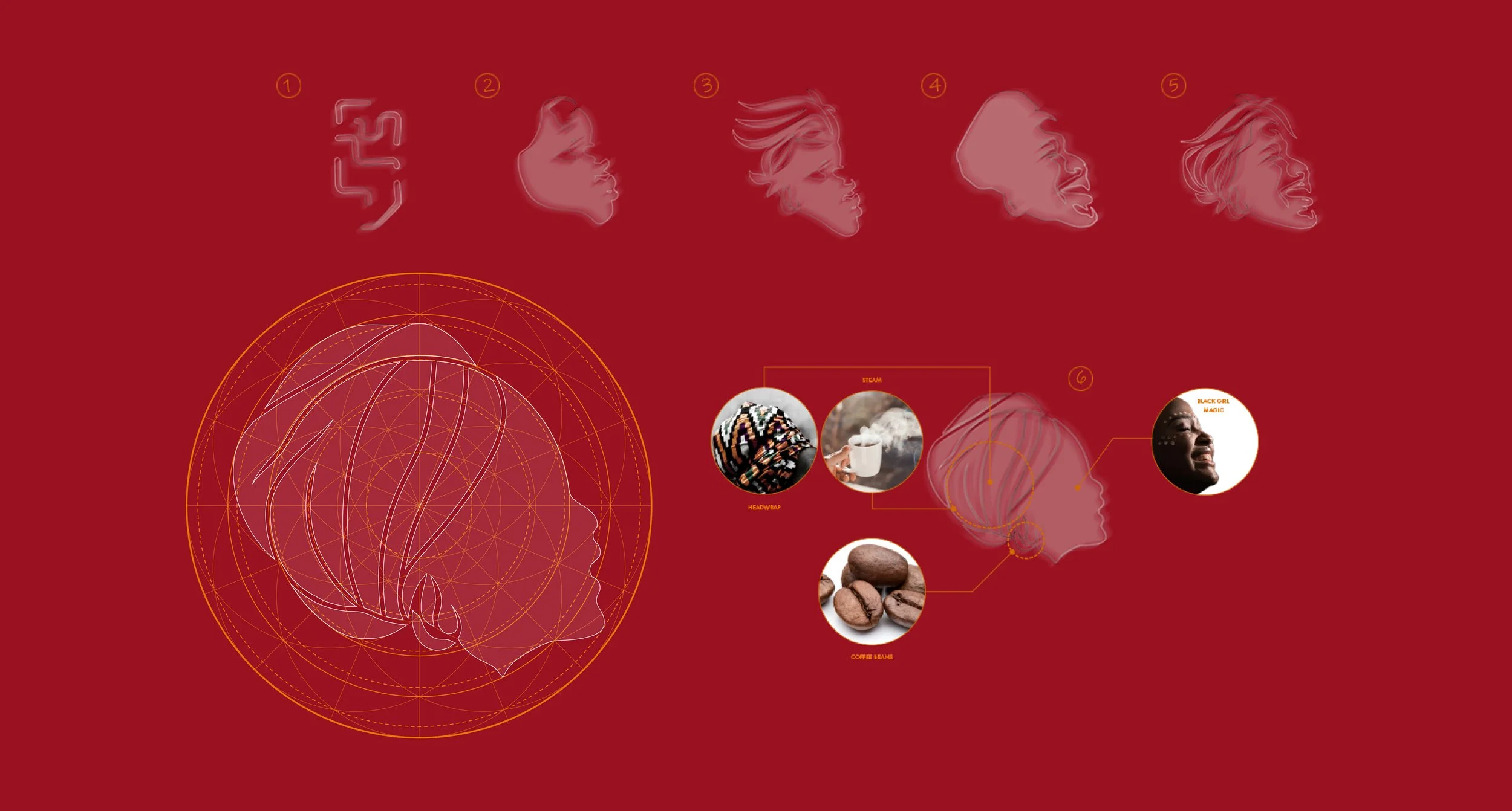
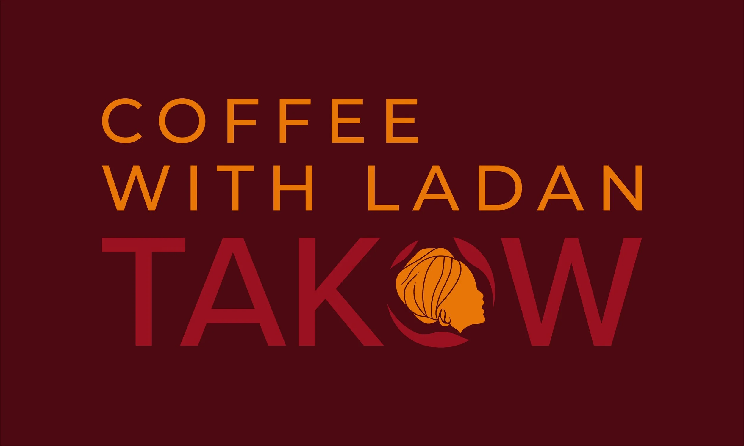
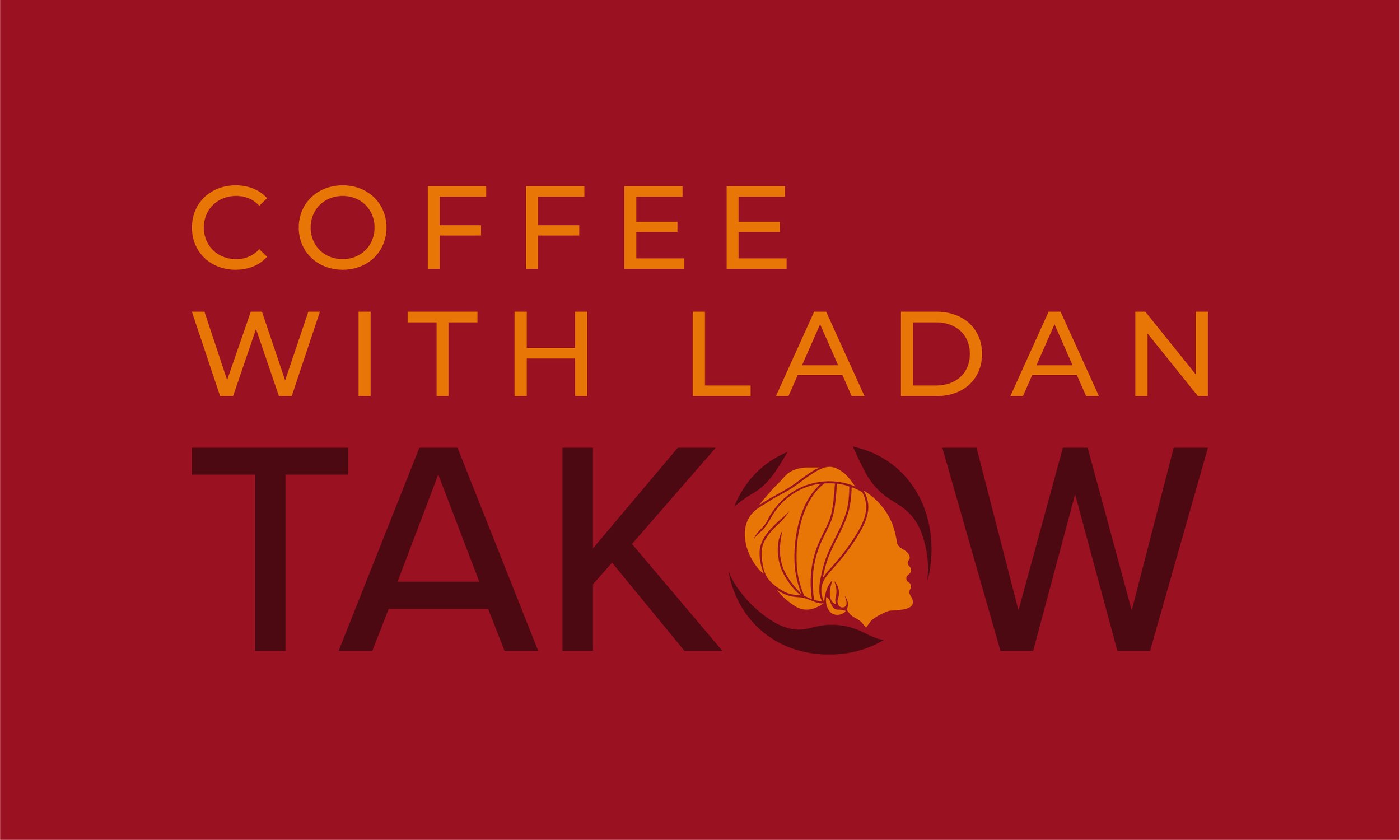
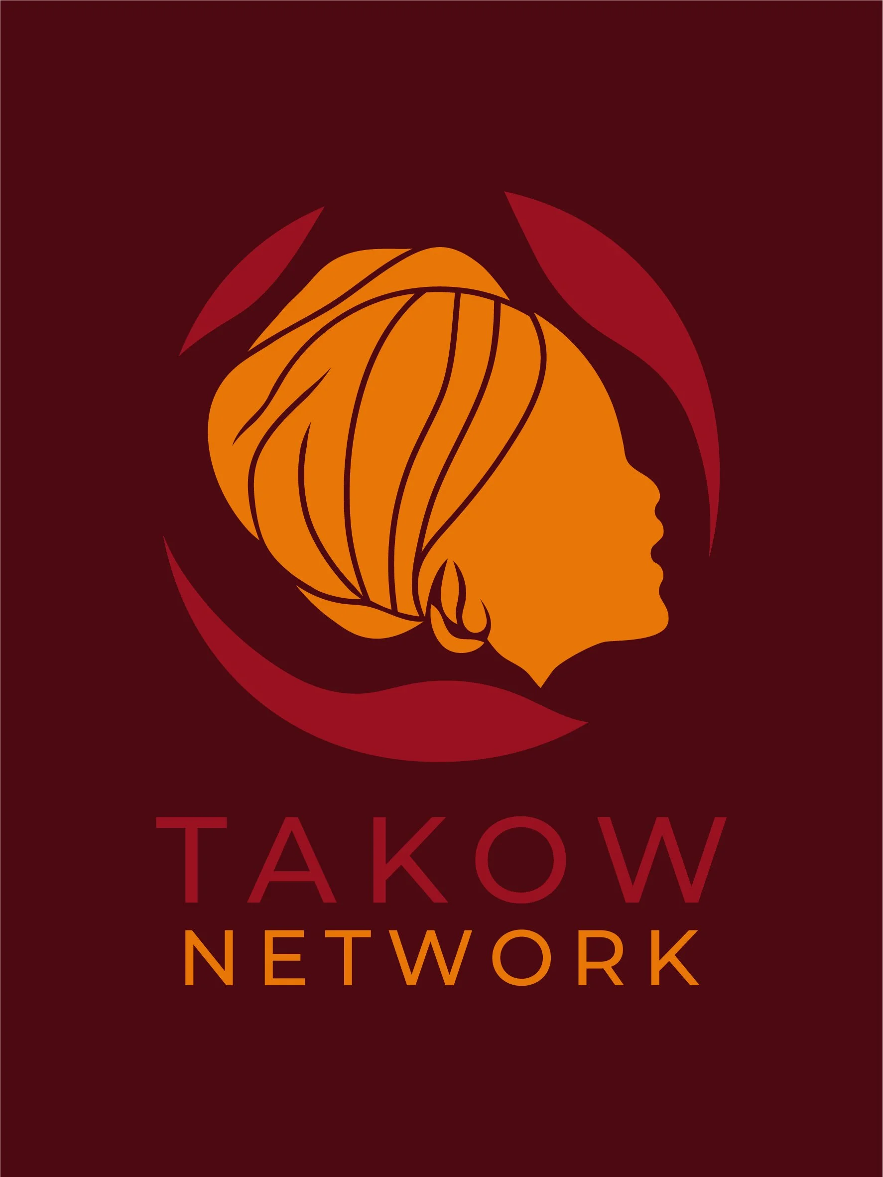
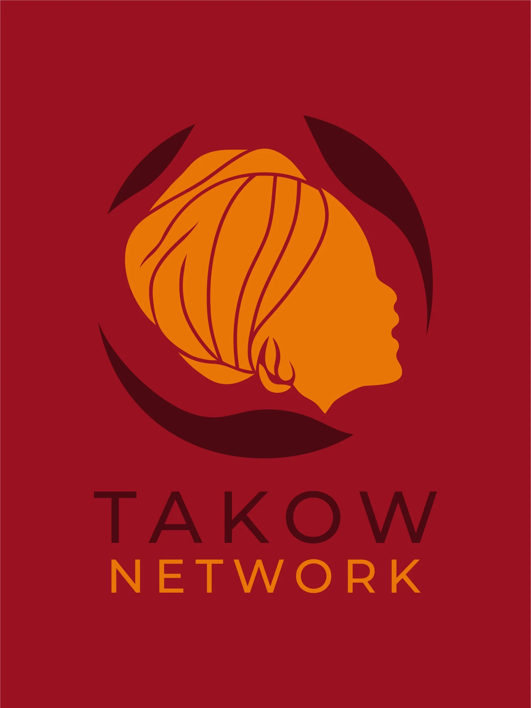
Creative & Simple
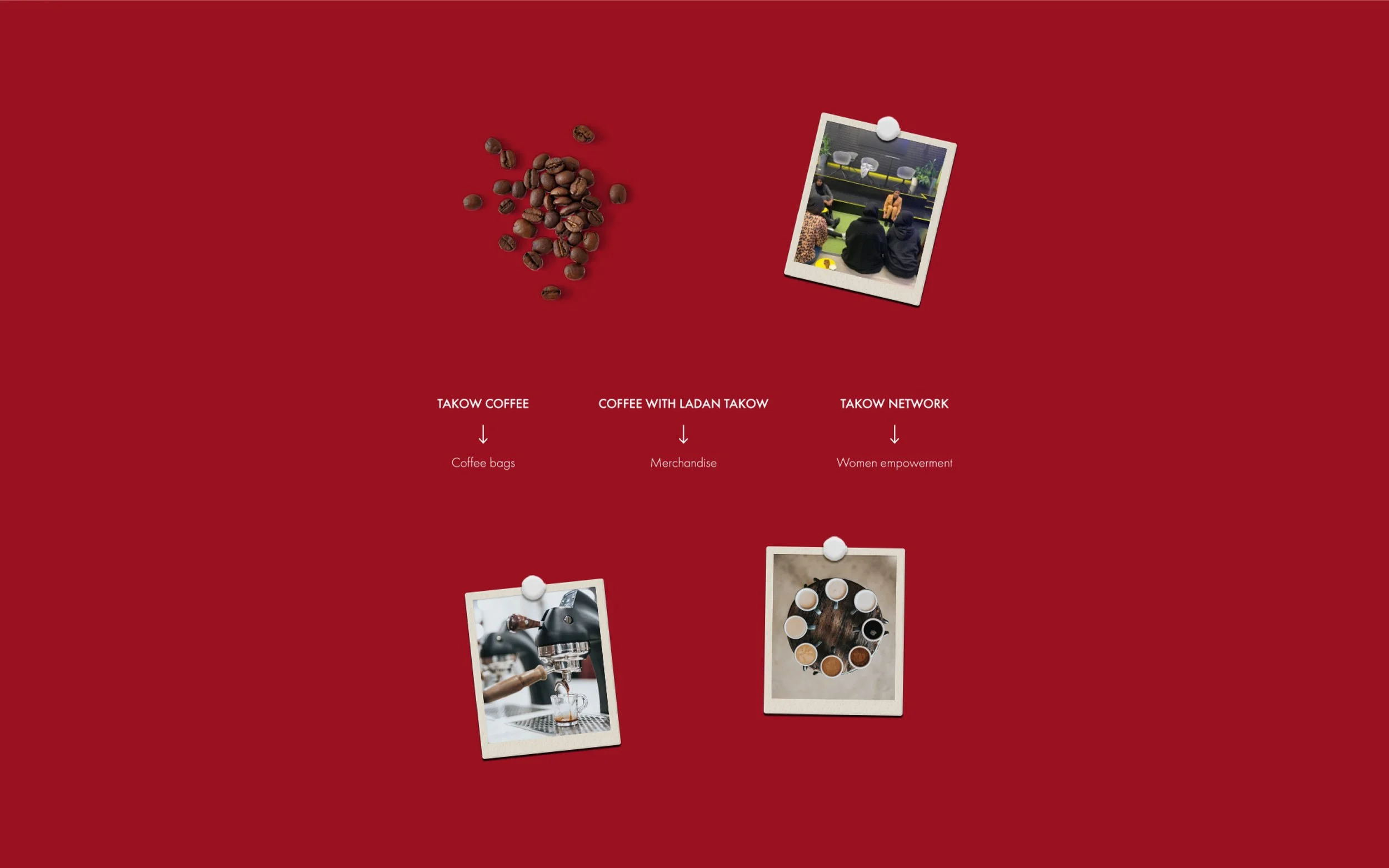
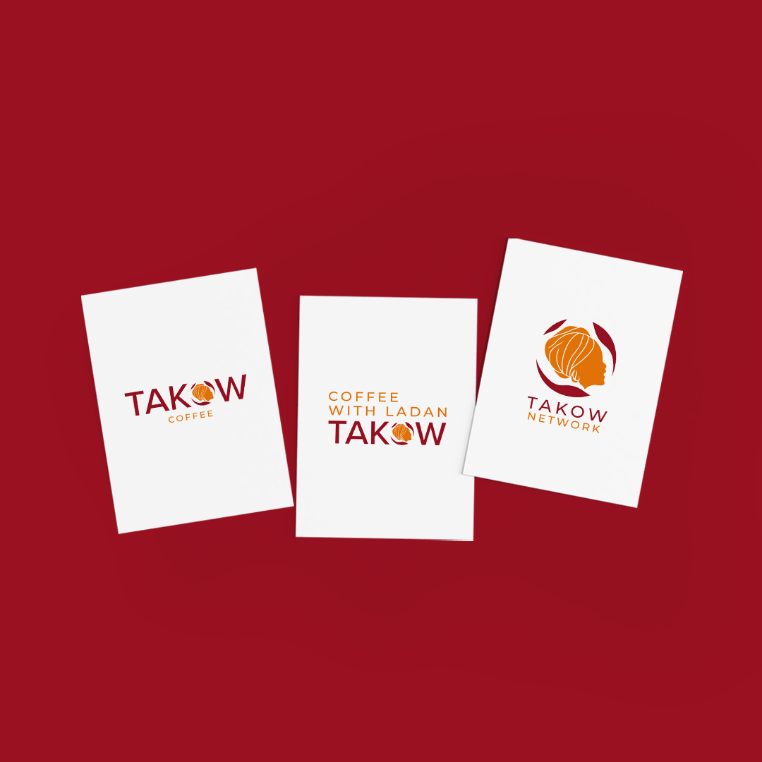
The Takow brand uses a unified color palette across all platforms, ensuring consistency while allowing each branch to maintain its unique positioning.
The logomark and logotype have been designed to work across digital and physical mediums, with the same colour scheme applied to everything from coffee packaging to merchandise and digital content. This consistency reinforces the brand’s identity, making it instantly recognisable no matter the context.
-
Logo
Branding
Strategy
Concept Design